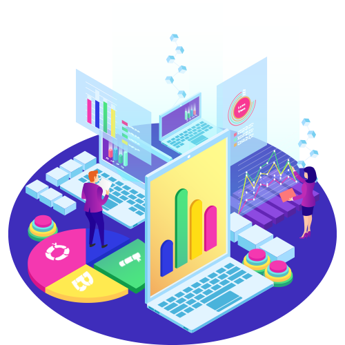
The rise of big data and data analysis initiatives has raised the significance of visualization. Machine learning is being used by businesses more and more to collect vast volumes of information that can be slow and difficult to filter through, understand, and explain. Information may be delivered to stakeholders and business owners in ways they can comprehend, speeding up the process.
Pie charts, histograms, and business graphs are just a few examples of the typical visualization approaches that are frequently employed with enormous data sets. Instead, it employs more intricate visualizations like heat maps and fever charts.
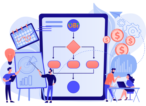
It takes very efficient computer systems to collect raw data, understand it, and translate it into graphical representations that humans can use to quickly draw conclusions.
While big data visualization has its advantages, there are also some drawbacks for businesses. These are what they are:
- A visualization specialist needs to be hired if big data visualization techniques are to be used to their full potential. To ensure that businesses are making the best use of their information, this specialist must be able to recognize the best data sets and visualization techniques.
- Since big data visualization demands strong computer hardware, effective storage systems, and sometimes even a shift to the cloud, it is common for IT to be involved in big data visualization initiatives along with management.
- Big data visualization can only yield insights that are as accurate as the data being displayed. As a result, it is crucial to have systems in place for managing and regulating the quality of the company's information, metadata, and sources.


 Your payment was processed successfully. Congratulations!
 You have cancelled the payment process.
 This popup does not exist. I'm sorry.